
Using a heatmap in a website is a great way to see how people are moving around the website. However, there are a few limitations to using a heatmap. If you’re looking for a great way to visualize your data, you may want to try other more advanced methods.
Datawrapper
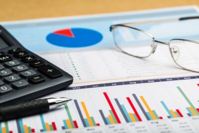
Using a heat map is an easy way to visualize patterns in data. They are ideal for measuring the density of variables or comparing the behavior of different visitors to a website. Using a heat map can also help you to determine which sections of your website are performing the best. It can also help you to identify any anomalies or differences in a group.
Datawrapper is a web-based data visualization application that helps users to easily create charts and visualizations. It has an intuitive interface that makes it easy for beginners to create charts. Datawrapper supports many different interactive maps and charts. It also offers the option to generate visualizations in PDF or PNG. Datawrapper also supports multi-touch on touchscreen devices.
Datawrapper is a free and collaborative tool that allows users to create charts and visualizations. The software offers a number of interactive maps and charts, and it has a responsive design. It also has the ability to create custom themes for white-labeled brands.
Datawrapper tables have a number of customization features, including custom column sorting, sorting and filtering of data, and many different styling options. They also offer a search function. Datawrapper’s tables allow users to style multiple columns at once.
Datawrapper supports a wide range of chart types, including maps, bar charts, pie charts, and other interactive graphs. Datawrapper also offers custom ranges, credit bylines, and links to data sources. Datawrapper is a great option for media organizations looking to create charts and visualizations for their website.
Datawrapper is a great tool for businesses looking to predict future outcomes. Datawrapper also has a collaborative interface, allowing teams to work together on projects.
Crazy Egg
Using Crazy Egg’s heatmap feature can be a great way to improve your website’s UX. It will help you track visitor activity and discover what elements on your site are driving conversions. You can then use the data to make tweaks to your design and content.
Crazy Egg also provides a “confetti” map, which lets you see which elements your visitors clicked on. You can then filter the data based on country, OS, referrer, and more. The heatmap is also a great way to discover where users lose interest.
As with any software tool, you should take the time to research the software before you decide to use it. Although Crazy Egg is a great tool, you should do your due diligence before you commit to it.
Crazy Egg is not the only tool out there that provides heat maps. In fact, Visitor Analytics offers similar functionality. They also offer a free demo and 30 day trial. However, Crazy Egg is the most comprehensive.
In addition to the heat map, Crazy Egg also offers a confetti map, which lets you see which elements your site visitors clicked on. You can also check out their A/B testing features, which is a good way to test different pages and determine which ones are more popular.
You can also view their Visitor Journey View, which allows you to see how your visitors travel from one page to the next. In addition, Crazy Egg offers free email and phone support for all plans. It is a great tool, but not for those who need a fast turnaround.
You may also want to consider using HotJar for its motion heat map feature. It also allows you to build teams and share data externally. However, if you use JavaScript on your website, you might run into compatibility issues.
Correlogram
Generally, correlograms are used to understand the relationships between two sets of variables. They help in the development of predictive statistical models and the analysis of time series. They are also useful in checking the randomness of a time series.
Correlograms are typically a matrix of numerical variables. The columns and rows are ordered based on the data. Each column represents one variable and the rows represent the relationship between two variable sets.
Another use for a correlogram is to find out if two variables are growing in the same direction. This is known as a positive correlation. The values in cells indicate the strength of a positive relationship. If the values are negative, the relationship is considered to be negative.
Correlograms are available in most general purpose statistical libraries. They are commonly used for model identification in Box-Jenkins autoregressive moving average time series models.
The principle of a correlogram is to substitute numerical variables on the axis with variables in the dataset. This helps readers to grasp the patterns in the data.
A correlogram is also a great way to measure autocorrelation, the hidden sine function. This is shown by mapping the colors to the numeric values. The dashed blue line shows the actual autocorrelation function of the sampled process.
Using the hclust function, it is possible to reorder the columns of the correlation matrix and thus produce a heat map. This function is useful when the number of observations is limited.
The hclust function is also useful when calculating the correlation between two variables. The correlation coefficient is also used to measure the strength of the relationship between the variables.
The correlogram is not as convenient as a heatmap because it does not show categorical features. However, it is still an excellent way to measure the randomness of a time series.
Bar chart
Using Heatmaps is a great way to present large amounts of data in a simple way. Heatmaps are a type of graph that uses a color gradient to show the magnitude of a value. They are used in a variety of applications including rating people, viewing populations, and analyzing website data. They can also be used to visualize variations in behavior.
 Heatmaps can be used to visualize data, and help readers understand the patterns within the data. Heatmaps also provide a way to detect and quantify outliers. Heatmaps display the values across two axis variables. They are usually accompanied by a legend to help viewers understand the values.
The legends help viewers understand how the colors map to the values. Heatmaps can be used to compare different attributes within a category. They can also be used to rate people or performance.
Heatmaps are a two-dimensional analogue to bar charts. The difference is that bar charts use length of strips to represent quantity. Heatmaps use color. Light colors represent smaller values, while darker colors represent larger values.
Heatmaps are often used to show “wow factor” or a ‘cool’ factor. They can also be used to highlight geographic areas, and rate people or performances. Heatmaps are useful for analyzing website data, and they can be used to provide insights into user engagement.
Heatmaps are one of the most common chart types. They can be created in Excel. They can also be added to a dashboard.
When choosing a color palette, you should choose one that matches the data type. If your data doesn’t have an inherent association with color, then the colors may need to be adjusted manually. Choosing the right color palette will help viewers understand the values.
Histogram
Unlike other chart types, a heatmap uses two dimensions to display data. Each column in the dimension contains a cell that represents a value relative to all other cells in the column. These values are colored in a gradient. This can be a useful way to display patterns and trends in large amounts of data.
A heat map is a type of color coded image plot. It displays the distribution of variables over an arbitrary grid. The number of cells in the grid depends on the type of data. There are a few common ways to display numeric axis variables. These include tick marks in each bin and categorical labels.
A heat map is often used to highlight patterns in data. The color of each cell is related to the number of points within the cell. The color coding can be considered as a matrix. The scale of the color scale can be fixed or variable.
Heatmaps are also useful for rating people and businesses. For example, they can be used to rate people’s performances, jobs, or places. Heatmaps can also be used to highlight patterns in large amounts of data.
Heatmaps can also be used to detect hot and cold spots in geographic regions. Heat maps can help assess regional demographics and detect anomalies. They also help website owners and marketers find underserved markets.
Correlograms are a specialized form of heatmap. The difference between a heatmap and a correlogram is that the former replaces variables on the axes with numerical variables from the data set. The correlogram is used to help analysts build predictive statistical models.
While the heatmap is a popular visualization tool, it does have some limitations. The main limitation is that the values displayed are not constrained to a grid. This makes it difficult to compare the values.
All-In-One SEO Tool
Get Web Hosting
Learn Online Business


