
When you are trying to understand how to analyze a heatmap, there are a few things to remember. First, a heatmap is a tool that shows you which sections of your site are getting the most traffic. You can then use that information to make better decisions about which areas you need to focus on. Secondly, a heatmap can be used to determine conversion behaviors, which can be very useful in optimizing your site.
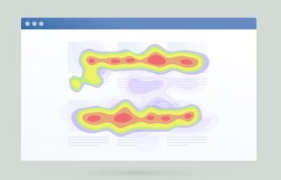
Eye-tracking heatmap
Eye tracking heatmaps provide a nifty way to see how a user reacts to your website. They can be used to determine what parts of your website are drawing attention, and to highlight what content could be more engaging.
There are many types of heatmaps. Some are simply an analysis tool, while others are visualizations of the data. Ultimately, they both offer a more thorough view of your data.
Regardless of the type, all eye-tracking heatmaps display data on visitor eye movement. This information can be useful for marketers, UX designers, and even CRO practitioners.
While some eye-tracking heatmaps are based on in-person studies, most are conducted remotely, using a webcam or other device connected to the viewer’s computer. These heatmaps can be expensive, however, and require the investment of a professional.
AI-generated attention heatmaps are a better bet for companies looking to track their users’ attention, and to predict what they’re most likely to notice. The color scheme for these maps is a bit more complex, but they are designed to look just like the traditional eye-tracking type.
The most impressive thing about an AI-generated attention heatmap is that it can show where most people are likely to focus their attention. Moreover, it can do this with a 95% degree of accuracy.
Combined with other analytical tools, heat maps can be used to understand how visitors navigate your website. They can identify bottlenecks and roadblocks, and help you optimize the user experience. You can also use them to understand if your website requires better imagery.
Eye-tracking heatmaps are one of the most useful tools you can use for analyzing your visitors’ behavior. They can also be used to improve your customer’s experience and increase conversions.
Scroll map
The scroll map is a great way to analyze user behavior on your website. It lets you see the elements that get the most attention from your readers. Identifying this information can help you better optimize your site.
Scroll maps are similar to heat maps in that they show what users are doing on your page. They also measure what sections on your page are most engaging. This is especially useful when you have a long article. Using a scroll map can help you figure out where to put more of the important stuff.
One of the most important things you can learn from a scroll map is where users are actually clicking. You can then use the data to identify areas of your website where your visitors are struggling to find the content they are looking for.
A scroll map can even tell you where to place more converting elements. For example, it can tell you where to place the CTA button. By doing so, you can run customers further down the sales funnel.
The scroll map also shows you where to place the most important content on your site. For example, if you have a CTA button at the top of your page, you may want to keep the rest of your landing page below it. That is because the CTA button gets the most clicks.
Another good reason to use a scroll map is to see if your audience is actually scrolling to the end of the page. You can use the data to determine if your page length is optimal.
Another useful feature of a scroll map is the ability to view your statistics across different devices. Your visitors may have a different screen size and viewing stance than you do. These differences could make a difference to your users’ willingness to scroll through your page.
Mouse-tracking heatmap
Mouse-tracking heatmaps, also known as mouse movement heatmaps, capture mouse movement data. They record user activity on your website, including how long they spend in a certain area and the number of clicks they make.
The data collected can be used to analyze how users navigate your website, what elements they like and what areas are more difficult to use. You can also determine the impact of changes you make to your site. This way, you can optimize your page for different devices and improve your conversion rates.
Heat maps are an invaluable tool for any marketer. They are visually descriptive and easy to read. Their color coding scheme makes it easier to analyze and evaluate activity. By tracking users’ eye and mouse movements, you can get insights into how visitors interact with your page and its design.
Mouse tracking heatmaps can help you identify what areas of your website need more attention. Often, people place their mouse in the spot where they hold their attention, and the information that’s most important to them is in the header or the first few lines of text. Using this type of heat map can highlight the most crucial information on your webpage and can help you increase conversion rates.
Similarly, eye-tracking heatmaps track the number of times a user looks at a particular section of your page. These maps can tell you the most eye-catching parts of your website, as well as the least-looked-at sections.
Another way to analyze mouse-tracking heatmaps is to look at their historical data. This helps you uncover harmful changes that might have occurred before they were discovered. It also provides context to your analysis.
Conversion behavior
Using heatmaps can help you analyze conversion behavior. With this insight, you can identify areas on your website that aren’t working, as well as identify how to better allocate your advertising budget. This will allow you to make smarter business decisions that increase conversions.
 Heatmaps are also a great tool for evaluating the user experience. They help you find out where visitors are clicking and where they are getting stuck. By knowing where visitors are focusing, you can adjust the layout of your website to increase your conversion rate.
Another way to understand your visitors is through session recordings. These are recordings of users’ eye movements. A heat map can then be used to track where they are focused and what they are doing.
Heatmaps come in four different formats. You can create one for every page on your site or you can build a heatmap for a specific conversion event, such as clicks or conversions. It’s up to you to determine what type of heatmap would work best for your business.
For example, if you’re using an ecommerce site, you may want to use a scroll map to see how much content is being explored by your visitors. If there isn’t enough content, you’ll find it hard to entice them to stick around.
Similarly, if you have a product that has lots of imagery, you may want to use a move map. A move map will show you where your audience is spending the most time on your site. When you know this information, you can put the most important content in places where people are likely to spend the most time.
Issues with heatmaps
Heatmaps are a great way to improve user experiences and boost conversions. They show users how to use a site, and allow marketers and product owners to fix any usability issues. In fact, all websites want happy visitors, and heatmaps can help you do just that.
There are several types of heat maps. The scroll heat map is a useful tool for tracking the amount of content a user sees. However, it’s not the only way to gauge user behavior.
The click heat map is also a great way to see how users interact with a site. It shows the number of clicks on an element, as well as the average percentage of hoverers who click.
The attention heat map is a similar way to show how a user moves through a page. Unlike the scroll heat map, this one shows how long the mouse is pressed, and how much of the page is viewed by the mouse.
Another good way to gauge how a website is being used is the geographic heat map. This will let you know how many visitors have come from a particular geographic location. You may also want to check out the session replay feature. These are individual recordings of people visiting a site. By analyzing this data, you’ll be able to better understand why some users are clicking on your links.
Finally, the historical heat map is a good way to get a better grasp of how a website changes over time. It gives you a complete picture of what happened prior to the changes, as well as what happened after the changes took place.
All-In-One SEO Tool
Get Web Hosting
Learn Online Business


